02 / Editorial / Studio study
Editorial Colour Continuity Across a Series
Editorial consistency is built through relationships: skin against wardrobe, subject against background and one frame against the next.
The brief
What the image
needed.
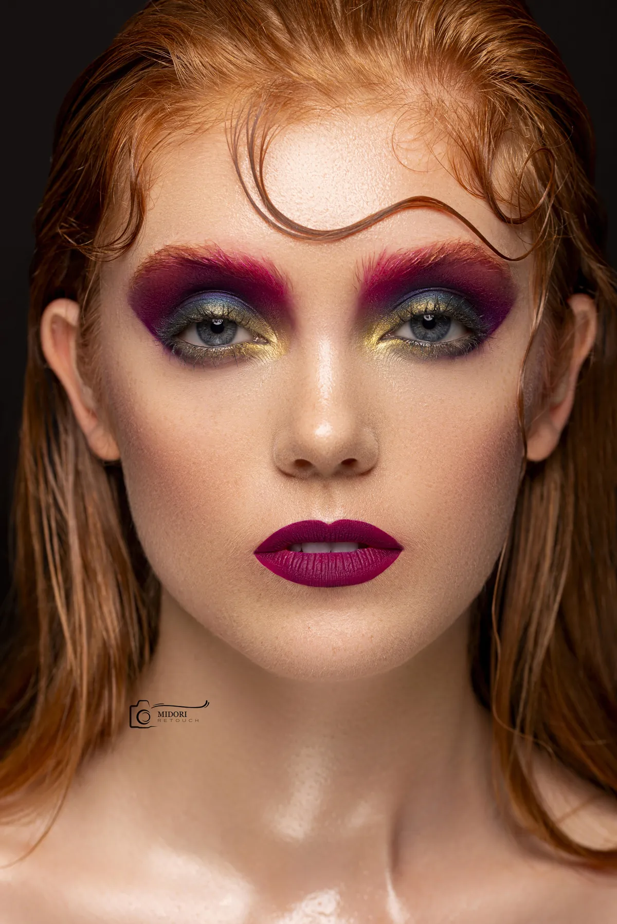
Develop a repeatable editorial finishing language that allows different portraits to retain their own mood while still feeling part of one considered body of work. The frames contain different wardrobe colours, backgrounds and tonal densities, so matching them by applying one global grade would remove their individual character. The challenge was to define shared visual relationships rather than force every histogram or skin value to become identical.
- Service
- Editorial retouching
- Focus
- Series colour continuity
- Output
- Publication-ready image sequence
- Workflow
- Reference-led finishing
The approach
Reference frames
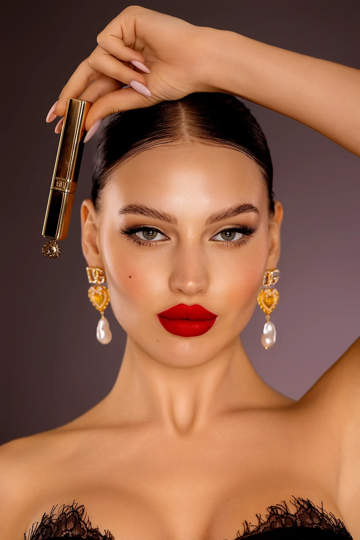
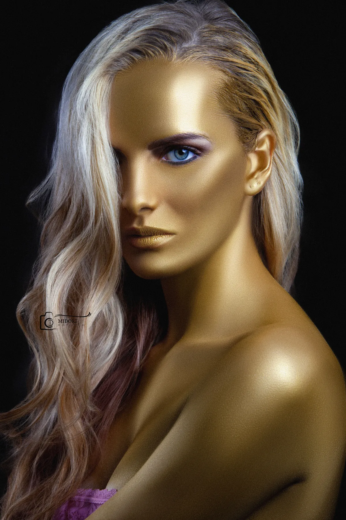
Hero images established the intended skin tone, black point, saturation and atmospheric density before the remaining frames were assessed.
Local colour
Skin, wardrobe and background were corrected separately where global adjustments would have made the image feel forced.
Detail hierarchy
Cleanup and tonal shaping guided attention toward expression and styling while avoiding a uniformly polished commercial finish.
Sequence review
Frames were compared at a consistent size and in viewing order to identify sudden changes in warmth, contrast or saturation.
Publication check
The sequence was reviewed as individual images and as adjacent frames. Crop, black point, skin colour and visual weight were checked so a designer could place the files together without unexpected jumps between pages or screens.
The outcome
The study demonstrates how a series can remain varied without becoming visually disconnected. Each frame has its own energy, supported by a shared approach to colour and tonal depth. This is the central difference between matching files mechanically and finishing an editorial story: consistency comes from a common visual intention, not from making every image look the same.
Looking for this level of finish?